Mother Russia Review by Eugene Alejandro

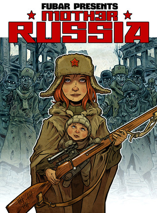
Jeff McComsey’s Mother Russia is a zombie graphic novel that takes place in an alternate time in history (the 1940s) in which Soviet Russia has become victim to the Zombie apocalypse (there really isn’t an explanation for it either). The story mostly focuses on a female sniper in Russia who is trying to survive from the zombies, and she ends up rescuing a little boy only to also be saved by a former German soldier along with his pet German Shepard dog.

As far as zombie survival stories go, Mother Russia surely is an entertaining read with interesting characters and a nice concept. I most certainly recommend getting the graphic novel collection as after the main story ends, the collected edition includes bonus stories giving origins to all the main characters. They are all written by Jeff McComsey, but each one is illustrated by a different artist.

Speaking of the artwork, not only did Jeff McComsey create and write Mother Russia, he also drew it as well. His artwork in the interior pages are in black and white, and it is decent to look at, and fits the tone of the story very well. The bonus stories (like I said earlier in this review) are each illustrated by different artists. While each artist has a different style of penciling and inking, each one works for the respective stories they worked on, and doesn’t really distract from the fact that they are each a huge contrast to the main story’s art.

The only nitpick I have with Mother Russia is the ending. I won’t spoil how the ending goes, but I will warn that is does give the reader a “really? That quick?” vibe. It wasn’t a terrible ending, but I felt it could’ve been better.

While Mother Russia may not be something new, ground breaking, and mind blowing, it’s certainly a good enough read if you are someone who enjoys zombies and horror.

I give Mother Russia Two Thumbs Up, and 4/5 Stars.

Methaphase Review by Eugene Alejandro

Methaphase is about a young boy named Ollie who is the son of a famous superhero named Sentinel. Ollie wants to be a superhero just like his father, but Ollie’s father is worried and doesn’t feel like he should because Ollie was born with Down Syndrome (meaning that Sentinel is only looking our for Ollie with good intentions). I should clarify that there is much more to the plot of Methaphase than what I just said, but I feel that saying more would just ultimately ruin anyone else’s chance of wanting to buy and read it, so I’ll just say the basic summary of it for this review.

There exists a message in Methaphase which is that no matter what condition you have, you can always achieve the best at what you wanna be, and that message is handled very well in the story. Methaphase’s writing is done very well, and story moves at a quick but solid pace. I should inform the people who are reading this review that Methaphase is only 82 pages long, but despite the short page count, the story is still a very good one thanks to the strong and powerful message that it carries.

The pencils, inks, and colors in Methaphase are all very good. Each character is designed very well, the inking helps the art look clear and easy to see, and the coloring does a fantastic job and bringing the artwork to life. Before I forget now that I’ve just thought about it, the lettering on Methaphase is done by none other than Alterna Comics owner and founder; Peter Simeti, who turns out a very solid job as far as the lettering is concerned as all the words are very easy to see.

While I don’t have anything negative to say and nitpick about Metaphase, I should inform people that this is not a single story. Meaning that there is a strong chance of a sequel happening (I won’t go into the specifics of that as you would have the read it yourself to know).

In conclusion, Methaphase is a well-made graphic novel in the superhero genre that I can totally recommend purchasing as a means to giving it a read.

I give Methaphase 4/5 Stars, and Two Thumbs Up.

Horror in the West Review by Eugene Alejandro

Disclaimer: This review is a very short one. I normally try to have my reviews be long, but this one is an exception. I hope everyone is okay with that.

Horror in the West a western graphic novel anthology from Alterna Comics that contains 11 stories each by different creative teams. These stories include Star Calf, Under The Mountain, The Devil’s Promenade, Lawson, Brother’s Keeper, The Hunters, Pinkerton Express, Sacred Heart Of Hell, The Amulet, El Tigre, and Captured in a Flash.

Normally, I don’t read a lot of anthologies, so I tend to not be to knowledgeable of how they are suppose to be structured. With that said, I found Horror in the West to be average at best.

While each story is separate from one another, the one thing they all have in common is that their artwork is black in white. As far the art goes, some stories looked fine, while others looked a bit bad as far the artwork is concerned.

Each stories did have very good premises, but because of how short they are, I couldn’t really get invested into them. If the stories had been longer, than I would’ve gotten to appreciate them for.

For what Horror in the West is, it’s an interesting experiment in trying to combine horror with western (specially as an anthology with each story made by different teams), but in the end, it didn’t really leave much of an impact for me. I DID NOT hate it, but I’m glad to have at least read it just because I was curious.

I give Horror in the West 3/5 Stars.

Empire of the Wolf Review by Eugene Alejandro

In case you couldn’t already tell by the cover art, Empire of the Wolf is set during the times of ancient Rome, but adds a supernatural element to this story by including Werewolves in it. The reason for why Werewolves exist in this story is actually very fascinating as it even goes as far as to tie it into Roman mythology, but for the sake of this review, I will try to avoid spoiling any further details about it.

What works very well about Empire of the Wolf is that with the exception of the Werewolves and Roman Mythology aspects of it, the story is surprisingly historically accurate how and what went on during the times of Ancient Rome. Another part of Emipre of the Wolf that surprised me was the fact that its very story driven, and not just a Werewolves in Ancient Rome kind of plot. All the main characters have a decent amount of depth put into them, and there is a very good explanation for Werewolves to be in this story.

Now the biggest nitpick that I have to say about Empire of the Wolf however, is the artwork. The artwork isn’t necessarily awful, but it just didn’t fit with the story’s tone to me. Also, some parts of the art just looked odd (some of the dogs looked like black sheep with canine teeth, and one character looked like he belonged in Spawn instead of this). As far as the coloring goes though, the colors were great, and they certainly worked for the story.

Another Nitpick that I have with Empire of the Wolf is that the way it ended felt way too rushed in my opinion. I really wished more time was given to build up the ending as opposed to it just trying to get itself over with. But for what it was, it was okay. I just wanted it to be better that’s all.

Empire of the Wolf may not be something Award worthy, but it’s still a decent read none of the less. If you are interested in it, please check it out.

I give Empire of the Wolf 3/5 Stars.

CLUSTERF@#K! Review by Eugene Alejandro

Published by Alterna Comics’s FUBAR Press imprint (it’s listed as so in the beginning of the book if you read it on ComiXology like I did), CLUSTERF@#K! is a supernatural comedy about two private detectives named Karl and Jim who arrest and turn in an wizard named Dante, as well his Goatman henchman. Jim and Karl bring them to the station, and the leader of the station wants to question Dante in hopes he will find a very powerful item. When he believes that the Goatman is the key in finding the item, he of course wants him. Karl and Jim overhear this, and decide to bring the Goatman with them as they don’t trust their boss’s intentions. When this happens, the leader of the detective agency sends more agents after Karl, Jim, and the Goatman, and even makes a deal with a gang of Werewolves to find them as well. With agents and werewolves after them, Jim and Karl do what they can to protect the Goatman, and deal with the “CLUSTERF@#K!” thrown at them (hence the title).

The creator credits for CLUSTERF@#K! are Jon Parish (the writer), Nic J Shaw, Steven Forbes, Claudio Gaete, and Diego Toro (the artists with Diego Toro also being the inker), and Kote Carvajal (the colorist).

CLUSTERF@#K! is a fun and entertaining story as it works well as a comedy with supernatural elements in it with the both of those genres being used together with effort. Despite the big amount of foul language, and graphic violence in it, it all works with CLUSTERF@#K!’s tone because it shows that it’s not suppose to be taken seriously since it’s a comedy to begin with.

The artwork by all who made it that I mentioned earlier has a combination of the art styles of Cory Hamscher, and way some human characters look in Pixar films (at least in my opinion anyways). That style of art is a perfect fit for CLUSTERF@#K! as it helps show the plot’s humorous and lighthearted tone, while at the same time being a story for adults. Kote Carvajal’s coloring is also spectacular and blends with the art very well.

There are some parts of CLUSTERF@#K! that do feel a little bit predictable, but for the most part, the rest of the story does have a lot of clever twists and ideas in it, and the ending isn’t a blatant cliff-hanger, but there is a lot of ambiguity to it that I hope another story does happen.

So if you want to read a hilarious supernatural comic with detectives, werewolves, and demons in it, please purchase and read CLUSTERF@#K!

I give CLUSTERF@#K! Two Thumbs, and 4/5 Stars.

Cannons In The Clouds Review by Eugene Alejandro

Cannons in the Clouds is steampunk pirate story about a young woman named Sela Windbourne who wants to be free and independent from her own life, and ends up getting involved with pirates, and also ends being a part of a huge adventure with lots of action, twists and turns, etc.

Before I talk about anything else about Cannons in the Clouds, I first wanna talk about its artwork as I feel that for this review, it’s the most important part to bring up. While the artwork isn’t awful, I feel as it looks like rushed layouts as the characters, backgrounds, and everything else lacks any strong amount of detail to them. While the coloring is nice to look at, the highlights and shading on it tend to look too strong in some parts of the story, and can be very distracting.

As far as the writing and lettering in Cannons in the Clouds goes, it’s very solid, and helps make the story an enjoyable read. The characters have a solid amount of good writing and development to them, and some of the humorous moments also help the plot flow well. I DO NOT wanna spoil Cannons in the Clouds, but what I will say is that it has a nice ending that hopefully sets up a sequel.

Cannons in the Cloud’s lettering is very easy to look at which is the good thing so that readers can fully understand the plot. I will admit however that since I read it from the ComiXology app on my cellphone, I did have to zoom in a but on some pages just to see the words the characters were saying. So I would mostly recommend reading Cannons in the Clouds in physical print edition so that you don’t have to worry about zooming in on the lettering.

While Cannons in the Clouds may not have the greatest artwork of all time in my opinion, the way its written certainly makes it a recommendation for those that wanna see a story that combines pirates and steampunk together.

I give Cannons in the Clouds 4/5 Stars, and Two Thumbs Up.

Bleen Review by Eugene Alejandro

The story of Bleen is about a teenage girl literally named Bleen who is sent to a mental facility called Mayber Hills Sanitarium along with her pet rabbit Mr. Wiggles. When one of the employees (as well the other patients) of the facility start mistreating her (and even cause harm to Mr. Wiggles), the monsters that she has been seeing as a young kid (and the reason why she’s sent to the facility) start to come back and haunt her.

Bleen is created and written by Jon A. Colunga, with black and white artwork by Landon Huber, it is also lettered by both Jon A. Colunga and Landon Huber, and is published by Alterna Comics.

Right off the bat, Bleen definitely has a good set-up for a decent psychological horror story, and with all honesty, it works well for what it is. Bleen isn’t really anything groundbreaking for the horror genre, but it’s also not awful. The writing in my opinion is average at best for this story.

Landon Huber’s art is done in a black and white style, and it works fine for the tone of the story, the inking has a lot of impressive detail to it, but the way the characters are drawn sometimes feel a bit too cartoony for the story. I’m aware that for a horror like this that way to draw characters is suppose to work, but for me, it just felt out of place. I don’t hate the way the characters are drawn, but it’s just not my cup of tea. Again, the inking is spectacular and even the monsters are drawn well.

The lettering in Bleen is very well-done and easy to look at. It’s also impressive to know that both Jon and Landon did the lettering as there really isn’t a difference between the two of their lettering styles, and for a horror comic it looks great. The dialogue the characters speak is also good.

I don’t want to spoil the ending of Bleen at all, but I gotta say that the last chapter is very anti-climactic and rushed. I wasn’t expecting the best ending ever, but I did hope that it would’ve been better.

Overall, Bleen is an average comic in the horror genre with decent writing and decent artwork. The inking and lettering are really amazing for sure, and while I didn’t love the story, I didn’t hate it, and I wouldn’t mind checking it out for yourself.

I give Bleen 3/5 Stars.

My Announcement for Alterna Months Part 1 of 2

While the Supreme Writer Studios WordPress Blog has been on hiatus, I have been working on making some new reviews for the blog. What will happen is that next month, I will publish 7 reviews on Supreme Writer Studios. These reviews are of graphic novels published by Alterna Comics, and they are going to be part of an event I’ve made for myself and the blog titled “Alterna Months Part 1 of 2”. The reason why I’ve split the event into two parts is because sadly due to time and financial reasons, I was only able to complete the first part. If I’m able to have the time and afford the rest of the Alterna Comics graphic novels in order to finally completed the second and final part of Alterna Months, I’ll make another blog announcing that. I must also say that all the graphic novels that will be included in the Alterna Months are going to be purchased by me from ComiXology (the already completed 7 reviews were purchased by me on ComiXology by the way). With all that out of the way, here is the schedule for all the reviews included in Alterna Months Part 1 0f 2.

  • Bleen Review by Eugene Alejandro-4/3/2017
  • Cannons in the Clouds Review by Eugene Alejandro-4/8/2017
  • CLUSTERF@#K! Review by Eugene Alejandro-4/15/2017
  • Empire of the Wolf Review by Eugene Alejandro-4/19/2017
  • Horror in the West Review by Eugene Aljendro-4/22/2017
  • Metaphase Review by Eugene Alejandro-4/24/2017
  • Mother Russia Review by Eugene Alejandro-4/27/2017

If for some reason, I am unable to publish any of these reviews on the listed dates because of possible conflicts, I promise to talk about it on Social Media by announcing a different release date (hopefully that doesn’t have to happen though). And also, I will publish other reviews on Supreme Writer Studios after Alterna Months Part 1 0f 2 is done as a means to show that Supreme Writer Studios is still active. One more thing before I forget. If anyone comments on any of these reviews by acting like an immature idiot trying to get me upset for their own amusement (basically trolling), the people who dare do that will be permanently blocked from ever visiting Supreme Writer Studios as I have a zero tolerance policy on trolling for this blog. I’ve worked very hard in getting these reviews made, and I hope a lot of people can get the chance to finally read them.

If you are interested, you can follow me on Facebook, Twitter, and Instagram.

I also have two Facebook pages titled “Supreme Writer Studios“, and “The Color Flatting Skills of Eugene Alejandro” please give those a like if interested.

And also, please visit my DeviantArt page.